


Table of Contents
- Why Most Mortgage Broker Websites Fail to Convert
- Must-Have Features for High-Converting Mortgage Broker Websites
- Mortgage Website Calls to Action That Drive Applications
- Mortgage Website Live Chat and Automation
- Mortgage Website Accessibility and ADA Compliance
- Mortgage Broker Website Examples Worth Modeling
- Frequently Asked Questions
Last Updated: October 8, 2026
Why Most Mortgage Broker Websites Fail to Convert
Most mortgage broker websites fail because they treat a website like a brochure, not a lead machine. They list loan products, show a headshot, and wait. Meanwhile, borrowers leave in seconds when a page loads slowly or asks them to fill out a 12-field form.
The gap between a site that gets traffic and one that gets clients comes down to a handful of features. Below, we break down the essential features for high converting mortgage broker websites, from calculators to automation to accessibility.
Here’s the uncomfortable truth: a beautiful site with no lead capture is just an expensive business card.
Must-Have Features for High-Converting Mortgage Broker Websites
The features that separate top sites from the rest fall into three buckets: tools that engage visitors, forms that capture them, and speed that keeps them around. Skip any one and your conversion rate drops.
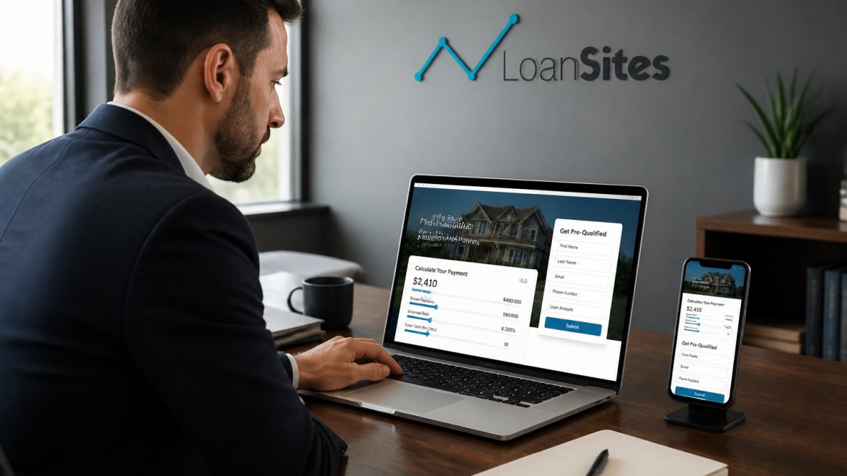
Clear digital interfaces serve as the foundation for client trust, yet the ability to articulate complex financial solutions remains equally vital when structuring high-converting presentations.
Mortgage Calculators and Affordability Tools
Mortgage calculators are the single highest-value tool you can put on your site. They give visitors an instant answer and give you a reason to ask for contact details.
mortgage website conversion features notes that interactive calculators that capture leads work best when paired with multi-step forms. A simple affordability calculator that asks for income, debts, and down payment does two jobs: it helps the borrower and it qualifies them.
We recommend three calculators at minimum:
- Affordability calculator (how much house can I buy)
- Payment calculator (monthly principal, interest, taxes, insurance)
- Refinance break-even calculator
Each one should end with a soft ask: “Want a personalized quote? Enter your email.”
Lead Capture Forms and Multi-Step Applications
Multi-step forms beat single-step forms for one reason: they feel easier. A borrower who sees “Step 1 of 4” will finish more often than one staring at 15 fields at once.
According to mortgage website lead research, multi-step forms convert significantly better than single-step forms. That’s because each step feels small and manageable.
Build your forms this way:
- Step 1: Loan purpose (purchase or refinance)
- Step 2: Property details
- Step 3: Financial basics
- Step 4: Contact info
Save the contact info for last. Once someone has invested three steps, they’ll finish.
Page Speed and Mobile-First Design
More than half of your visitors are on a phone. If your site takes longer than three seconds to load, they’re gone.
Speed and mobile design aren’t optional. They’re the foundation. Test your site on a real phone, not just a desktop browser. Check that buttons are thumb-friendly and forms don’t require pinch-zooming.
What to fix first:
- Compress images and use modern formats
- Cut unnecessary plugins and scripts
- Use a responsive layout that adapts to any screen
- Make your phone number tappable
A fast, mobile-friendly site keeps visitors long enough to convert.
Mortgage Website Calls to Action That Drive Applications
Your call to action is where visitors either commit or leave. Weak CTAs like “Learn More” waste the moment. Strong CTAs tell the borrower exactly what happens next.
Here’s what works:
- “Get My Rate Quote” instead of “Contact Us”
- “Check My Affordability” instead of “Apply Now”
- “Schedule a 15-Minute Call” instead of “Talk to an Expert”
Place a CTA above the fold, after each calculator, and at the end of every page. Use one primary action per page so you don’t split attention.
The best mortgage website calls to action combine a clear benefit with low commitment. A rate quote feels easier than a full application, so lead with it.
Mortgage Website Live Chat and Automation
Live chat answers questions the moment they come up, which is when borrowers are most engaged. But staffing chat around the clock isn’t realistic for most brokers.
That’s where AI live chat comes in. It responds instantly, answers common questions, and routes serious leads to you. mortgage lead follow-up guidance advises contacting leads within minutes and using automation to follow up. Speed wins deals.
Pair chat with automation:
- Instant text or email reply after a form submission
- A drip campaign that nurtures leads who aren’t ready yet
- Appointment scheduling that syncs to your calendar
The goal is simple: never let a lead go cold because you were busy.
Set your auto-reply to ask one qualifying question, like “Are you looking to buy or refinance?” It keeps the conversation moving and tells you how to route the lead.
Mortgage Website Accessibility and ADA Compliance
An inaccessible site shuts out borrowers and invites legal risk. Mortgage website accessibility means everyone can use your site, including people who rely on screen readers or keyboard navigation. But for mortgage brokers, accessibility intersects with something even more sensitive: the secure handling of financial data.
Why this matters more in mortgage than in other industries:
When a borrower enters their income, Social Security number, and bank details into your site, they’re trusting you with information that could be used for identity theft. That trust is fragile. A site that feels insecure or is difficult to navigate will lose the borrower before they ever hit submit.
Accessibility standards to follow:
The Web Content Accessibility Guidelines (WCAG) are the widely accepted standard. Aim for WCAG 2.1 Level AA compliance. Key requirements include:
- Perceivable: Alt text on every image, captions on video, sufficient color contrast (4.5:1 for normal text)
- Operable: Keyboard-navigable forms, no time limits on form completion, clear focus indicators
- Understandable: Clear labels on every input field, error messages that explain how to fix the problem
- Robust: Compatible with screen readers and assistive technologies
Mortgage-specific compliance considerations:
- Data encryption: Ensure your site uses HTTPS and that any form collecting financial data is encrypted in transit and at rest.
- Consent and disclosure: If you collect information for lead generation, you need clear consent language. The Telephone Consumer Protection Act (TCPA) governs how you can contact leads, and the Gramm-Leach-Bliley Act (GLBA) requires you to explain how you share nonpublic personal information.
- Avoid unsupported claims: Don’t promise rates you can’t deliver or imply approval you can’t guarantee. The Consumer Financial Protection Bureau (CFPB) and state regulators pay attention to misleading advertising.
- Record retention: Keep records of borrower communications and disclosures as required by law.
Practical fixes to implement now:
- Alt text on every image
- High-contrast text and buttons
- Keyboard-navigable forms
- Clear labels on every input field
- Captions on any video
- A visible privacy policy and terms of use
- A consent checkbox on lead forms that explains how you’ll use the borrower’s information
Audit your site with a screen reader and try navigating with only a keyboard. If you get stuck, so will your visitors. Then review your data-handling practices with the same scrutiny.
Skipping accessibility fixes can lead to demand letters and lawsuits. The cost of fixing your site is far lower than the cost of defending a claim. The same is true for data-handling lapses: a single breach can end a broker’s reputation.
Accessibility and compliance aren’t just legal checkboxes. They’re trust signals. A borrower who can easily navigate your site and understands how their data is protected is a borrower who is more likely to convert.
Mortgage Broker Website Examples Worth Modeling
The best mortgage broker website examples share a few traits: a clear headline, a calculator front and center, and a single obvious next step. They don’t bury the lead. But the strongest sites go further by layering in trust signals that address the borrower’s real question: “Can I trust this person with the biggest financial decision of my life?”
When you study a strong site, look for these elements:
Above the fold:
- A headline that names the borrower’s goal (“Find Your Best Mortgage Rate in Minutes”)
- A subhead that states your niche or specialty
- A primary CTA button with a benefit-driven label
- Trust badges or credentials visible without scrolling
Trust-building elements that competitors often overlook:
- Licensing and credentials: Display your NMLS ID prominently, along with any state-specific licenses. Borrowers increasingly check these before engaging.
- Reviews and testimonials: Embed Google reviews or a testimonial carousel near your lead form. Specific, named testimonials outperform anonymous quotes.
- Professional affiliations: Membership in organizations like the National Association of Mortgage Brokers (NAMB) or local real estate associations signals credibility.
- Privacy assurances: A visible link to your privacy policy and a short statement about how borrower data is protected. This matters more in mortgage than almost any other industry.
- Years in business and loan volume: If you’ve closed hundreds of loans, say so. Concrete numbers build confidence.
Form and conversion elements:
- A form that takes under a minute to complete
- Fast load times on mobile
- A clear privacy statement next to the submit button
Page architecture that guides different borrower intents:
- Homepage: Broad appeal with a clear value proposition and primary CTA
- Service pages: One page per loan type (FHA, VA, USDA, jumbo, refinance) so borrowers land on relevant content
- Landing pages: Dedicated pages for paid campaigns with a single conversion goal
- Resource pages: Educational content that builds trust and captures early-stage leads
Model the structure, not the design. A clean layout with the right features will outperform a flashy site with none. And remember: the goal isn’t to look like every other broker. It’s to give borrowers a reason to choose you over the template down the street.
At LoanSites, we build custom sites with unlimited support and unlimited customization, so your site keeps working as your business grows. We also offer advanced SEO for mortgage professionals and AI live chat to keep leads flowing.
Frequently Asked Questions
What should a mortgage broker website include to convert visitors?
A high-converting mortgage broker website needs interactive calculators, multi-step lead forms, a clear online application, mobile-friendly design, and fast load times. Multi-step forms convert significantly better than single-step forms. Trust signals like credentials, reviews, and privacy assurances matter too. Live chat and CRM integration help capture and follow up with mortgage leads quickly, before borrowers move to another lender. Without these, you get traffic but no applications.
How do mortgage brokers get leads from their websites?
Mortgage brokers generate leads by pairing search engine optimization with conversion-focused features. A mortgage calculator that captures contact details, appointment scheduling tools, and clear mortgage website calls to action all turn visitors into inquiries. Contacting leads within minutes and using automation for follow-up is recommended. Local SEO and organic search bring in borrowers actively looking for loan help, while drip campaigns nurture those who aren’t ready to apply yet.
Should a mortgage broker website have an online application?
Yes. An online application shortens the borrower journey and lets you capture loan application data at the moment of interest. Multi-step forms work better than long single-page forms because they feel less overwhelming and convert higher. Pair the application with a loan approval survey or pre-qualification tool so borrowers get instant feedback. Make sure the form is mobile-friendly and integrates with your CRM or loan origination system to avoid manual data entry.
How can mortgage brokers improve their website’s mobile experience?
Start with mobile-first design: responsive layouts, tap-friendly buttons, and forms that work on small screens. Page speed matters because slow-loading sites lose visitors before they convert. Test your mortgage calculator and application form on actual phones. Mobile-optimized templates and fast loading times are key features to look for. Also check that live chat and scheduling tools function properly on mobile, since many borrowers research lenders on their phones first.
Most brokers lose leads to slow sites, weak forms, and slow follow-up. LoanSites fixes all three. Our custom websites come with unlimited support and unlimited customization, plus ADA-compliant design, AI live chat, and CRM integration to nurture every borrower. Get started with LoanSites and turn your website into your best loan officer.


